Downloadable Resource
Blog
Webinar Recording
Success Story
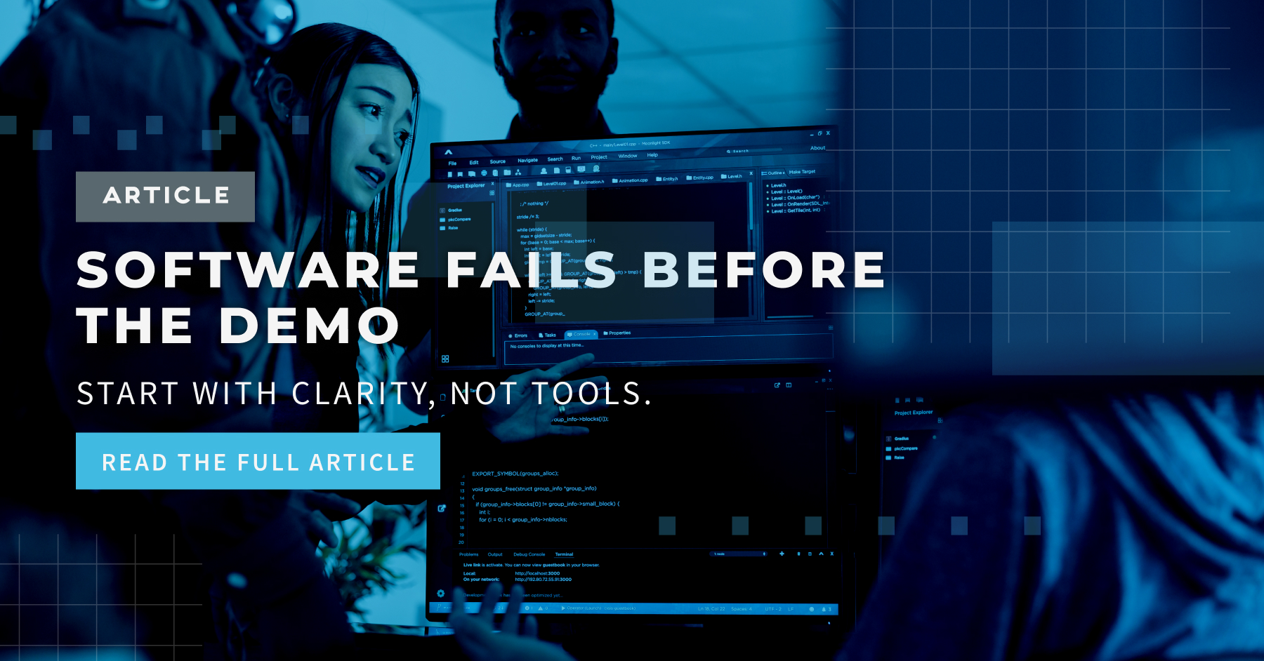
Article
Technical Article
Video Insight
Trade Show
Webinar
Tutorial
Video Demo

Preparing for Acumatica’s Modern UI
Join us on
May 31, 2026

Download Now
Acumatica’s Modern UI is more than a visual refresh. It is an intentional shift toward a more responsive, web-native experience with stronger personalization, improved navigation patterns, and a more consistent interface across devices.
For most organizations, the practical question is not “Is the new interface better?” It is: How will this change day-to-day work for accounting, operations, and power users who already have stable processes? The answer depends on how quickly teams understand what is truly different, where the friction points tend to show up, and which actions reduce training fatigue.
Below is a practical guide to help teams prepare, with an emphasis on what to evaluate now while Classic UI and Modern UI may coexist during the transition.
Event Details
Price:
$
USD
Location:
Virtual
Address:
1) Start with the real difference: Modern UI is a new experience layer
The biggest difference between Classic UI and Modern UI is not the color palette or spacing. It is the underlying approach to how screens behave and how users interact with them.
Modern UI is designed around:
More web-native interaction patterns (think faster, more responsive behavior)
Improved mobile responsiveness
More intuitive personalization for end users, not just administrators
More consistent filtering and list interactions across the platform
That means even when a screen still contains the same fields and supports the same workflow, the path a user takes to get something done may feel different.
Practical implication: training should focus less on “where did they move that button?” and more on “what is the new pattern for navigation, filtering, and saving a preferred view?”
2) Plan for a coexistence period (and make it a managed transition)
Many organizations will experience a period where Classic UI and Modern UI both exist across different screens, modules, or user groups. This is where frustration can spike: users learn a new interaction model, then bounce back into the old one unexpectedly.
What to do now
Identify the highest-traffic screens by role (AP, AR, purchasing, inventory, project accounting, etc.).
Map which screens are most critical to daily throughput (the ones that cannot slow down during month-end, close, or peak operational windows).
Build a short “UI readiness matrix”:
Screen name
Primary user roles
Frequency of use
Complexity (simple entry vs heavy filtering vs multi-step workflow)
Risk level if productivity drops
This creates a rational way to decide where to pilot, where to delay, and where to invest training first.
3) Expect changes in navigation and screen behavior; document the new “muscle memory”
Modern UI emphasizes streamlined navigation and updated layout behavior. For many users, the challenge is not capability; it is muscle memory.
Common friction points to anticipate
Users who rely on habit-based clicks (tabs, panels, or older placement of actions)
Users who work with multiple screens open and bounce rapidly between them
Users who “live” in list views and rely on fast filtering and sorting
Practical recommendation
Create role-based “day one workflows” that mirror actual tasks, such as:
“Enter and release an AP bill”
“Find and re-open a batch”
“Locate a customer payment exception and resolve it”
“Review and export an operational report”
Keep these to 5 to 8 workflows total and treat them as acceptance tests for productivity, not just training materials.
4) Filtering and saved views: treat this as the biggest productivity lever
In most ERPs, the time sink is not data entry. It is finding the right records quickly, then repeating that process every day.
Modern UI improvements around filtering, list interactions, and user-level preferences are where many teams will either gain efficiency or experience disruption, depending on how intentionally they adopt the new patterns.
What to do now
Identify the filters people use repeatedly:
“Open documents by vendor”
“Transactions in a date window”
“Exceptions that need review”
Standardize a short list of recommended saved views per role (finance, operations, admin).
Define when a saved view should be personal vs published (governance matters; otherwise “everyone customizes everything” becomes a support problem).
5) Personalization can reduce support tickets, but only with guardrails
Modern UI supports greater user-level personalization. That can be a major advantage if managed well; it can also create inconsistency if everyone changes screens differently without a baseline.
Use personalization strategically
Encourage users to personalize what improves speed and clarity, such as:
column order in grids
hiding nonessential fields
arranging frequently used fields higher on the screen
Avoid personalization that creates process risk:
hiding fields required for audit or approvals
rearranging screens in ways that confuse backups or cross-trained teammates
A practical governance approach
Define:
what users can personalize freely
what must remain standardized
who approves shared changes (admin, power user group, application owner)
6) Prepare for training fatigue with “micro-training” and internal champions
UI changes create a unique kind of frustration: users feel competent one day, then feel slower the next. That leads to resistance even if the new experience is objectively better.
Minimize training fatigue with these tactics
Micro-training: 10–15 minute sessions focused on one skill (filtering, navigation, personalization, managing layouts).
Office hours during the first two weeks of adoption.
Identify 1–2 champions per department who can answer questions quickly and reduce the “everything goes to IT/admin” bottleneck.
Keep a lightweight internal FAQ:
“How do I save my view?”
“Where did X move?”
“What should I do if I cannot find a field I used to use?”
7) Questions organizations should be asking now (before the switch becomes urgent)
A UI overhaul becomes painful when the project is reactive. These questions help teams stay proactive:
Readiness
Which user groups will be most impacted by new navigation and filtering patterns?
Which workflows cannot slow down (month-end, shipping, receiving, payroll-related processes)?
Governance
What is the policy for personalization vs standardized layouts?
Who owns decisions when departments want screens to look different?
Support
What will the “first line” of support be: internal champions, IT, the partner, or a mix?
How will issues and tips be captured so the same questions are not answered repeatedly?
Change management
What is the rollout plan: pilot group first, then staged rollout; or full cutover by department?
How will training be delivered without overwhelming end users?
A practical next step: treat this as an adoption project, not a feature update
If the Modern UI is approached as “a new coat of paint,” organizations tend to underestimate how much user experience drives productivity. If it is approached as an adoption project, the transition is usually smoother and the long-term benefits are easier to capture.
The goal is straightforward: help users become confident quickly, maintain throughput during critical periods, and avoid unnecessary rework caused by unmanaged personalization.
Want to go deeper on this topic?
Want a live walkthrough of what is changing, what is staying the same, and how to prepare users without disruption? Join the upcoming SmartTalks webinar: Preparing for Acumatica’s UI Overhaul on Wednesday, June 17th (12–1p CT), including open Q&A.
https://info.cs3technology.com/june-2026-smarttalks